Fighting the web obesity crisis using Hugo and Skeleton CSS
Now that I’ve graduated from my PhD, I find that I have more free time that was previously spent working on my dissertation. I also have the desire to continue to publish in some manner. My solution to both of these problems is to revamp my previous website which I only used as a portfolio site for job search purposes into a random blog.
In my time online I once came across a talk titled The Website Obesity Crisis. Since I’m already obsessed with minimalist systems, obligatory “I use Artix Linux and run dwm,” I internalized everything immediately and searched for the best way to design a modern and actually minimalist website (both design and size). I decided to try and serve a website which followed the design paradigm of the web pyramid graphic shown below:
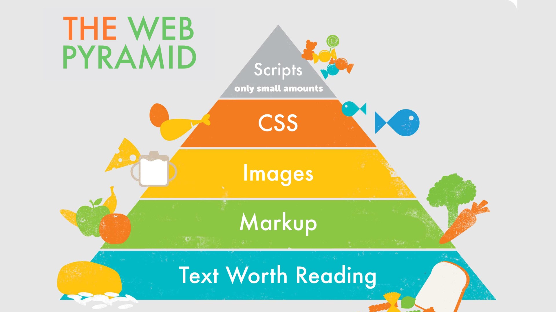
The ideal design for any website, source
I found that using Hugo combined with the Skeleton CSS boilerplate was the solution to a modern, minimalist, and “responsive” website. Read on to learn how I did it!
Website design paradigm
The rest of this article describes the different components and how I’ve adjusted them to suit my purposes. There exist a plethora of themes with complex Hugo shortcodes that allow easy customization from the config files. My personal site’s Hugo theme does not bother with attempting to offer endless customization options. Instead, if you want to use this theme you should be ready to adjust the CSS files and the Hugo HTML templates. With that in mind let’s get started.
Skeleton CSS
The most important component of this site is Skeleton CSS, which is a simple CSS boilerplate that serves as the foundation of my site.
Detailed documentation can be found at the link previously mentioned but I’ll describe the layout succinctly.
The fundamental container that everything should go into is <div class=container> which responsively scales it’s width based on the size of the browser/screen.
The next important div is <div class='row'> which is a row that contains the<div class="columns">.
This layout is shown below:
<div class="container">
|   <div class="row">
|   |   <div class="columns">
The Skeleton CSS grid has 12 columns, you can specify the number of columns by changing the class, e.g. <div class="one column", <div class="two columns">, ,<div class="eleven columns">, etc.
These divs will automatically stack instead of being shown side by side when the browser gets small enough, enabling a nice responsive layout.
I use this whenever I need to place items horizontally.
Note: You have to add:
<meta name="viewport" content="width=device-width, initial-scale=1">
to get this working properly for mobile devices.
Notes on some CSS styling I use
I won’t go into too much detail into the styling that I use, but I do want to mention a few things. First, if you want to learn how I wrote the responsive, navigation menu that I use for mobile, see my other post. The colors for my website are selected from the Gruvbox color scheme, shown below:
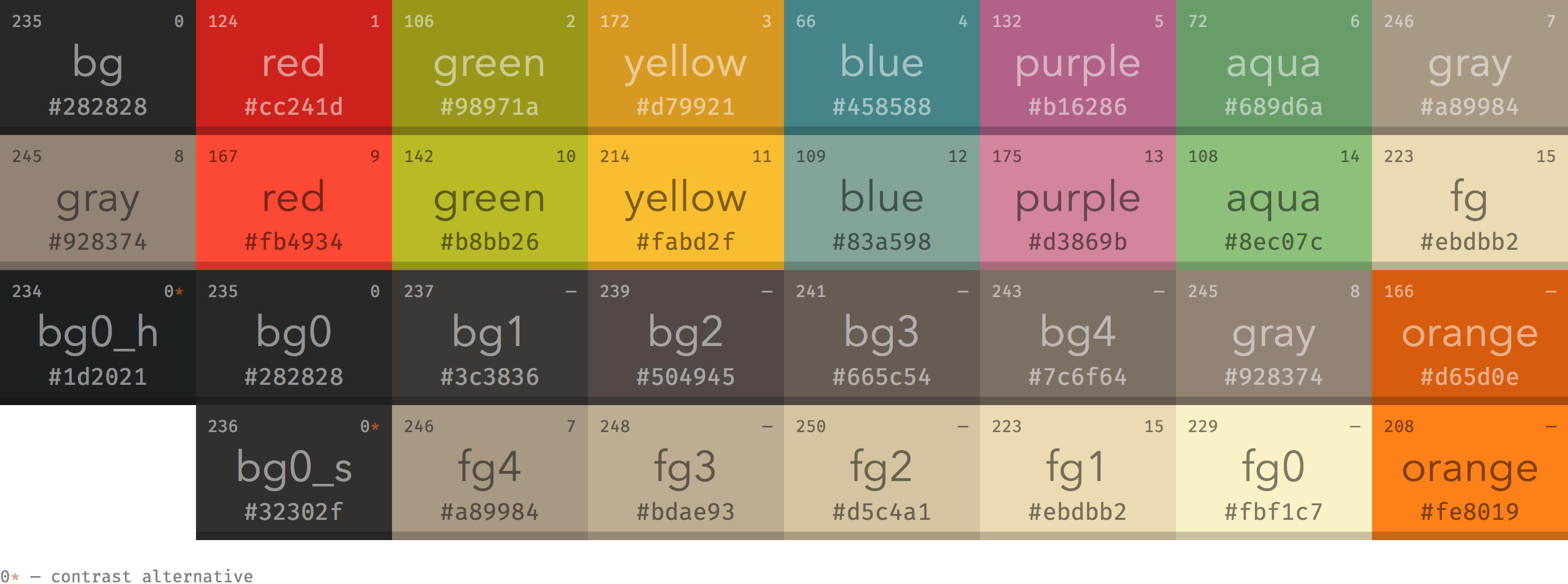
Gruvbox dark color scheme (I use it on everything), source
Since I probably am the only person that will actually be browsing my website, I want some sort of consistency between my terminal and my site. For fonts, I decided to copy Sakura CSS since those fonts looked very nice. If you have any questions about how I style a specific element shoot me an email or just read through the css stylesheet!
Using Hugo to fill in content
Now here comes the final step, which is utilizing Hugo. I again won’t write the full guide on how to use Hugo. You can check out the official Hugo guide for how to setup Hugo and some basic concepts. You can also check out the intro to Hugo by Luke Smith. I didn’t actually use this video to learn Hugo, but his stuff is usually pretty good so if video format works better for you maybe you can try that. The primary uses I have for Hugo are:
- Listing posts
- Tagging
- Table of Contents
To me these three topics are the biggest strengths of Hugo and justify the hours spent learning this new technology. So lets address each of these in order:
1. Listing posts
By default, for each of the directories containing .md files (such as content/posts) Hugo will create a list page containing all posts within that directory.
If you click on either the “Posts” or “Recipes” link at the top of this website you will see what such a page looks like.
The one thing that wasn’t as clear was how to include something like your five most recent posts on the front page.
I had the additional requirement that I only wanted posts from the actual “Posts” directory and not all posts from my site.
Specifically I didn’t want my homepage including my latest recipes.
The solution is pretty simple, is shown below, and should be included in your base index.html at /path/to/site/themes/{theme}/layout/index.html:
{{ range ( where .Site.RegularPages "Type" "posts" | first 5 ) }}
       <a href="{{ .Permalink }}">
           <h4>{{ .Params.title }}</h4>
           <p style="font-size:1.6rem">{{ dateFormat "Jan 2, 2006" .Date }} </p>
           <p style="font-size:1.8rem">{{.Summary }}</p>
       </a>
{{end}}
You will notice that the important part is the range statement which selects only pages with Type "posts" and selects the first five of them.
The rest of the code pulls out the various frontmatter of the post being display.
I like to show the date of the post as well as a brief summary.
2. Tagging
The full guide to taxonomies is on the Hugo site. I use two types of taxonomies that I define in my config.yaml:
taxonomies:
  tag: "tags"
  topic: "topics"
The format for a taxonomy is that you have to specify the taxonomy as the key and the plural of the taxonomy as the value.
I use the tags taxonomy for organizing my recipes and the topics taxonomy to organize my posts.
You can list all values for a specific taxonomy in the list page by including the following code in your list.html for the specific topic.
Each value for the taxonomy will link to a page that lists all post with that specific value.
The example below lists the topics taxonomy for my posts, so this is included in list.html at themes/personal/layout/posts/list.html:
{{ range .Site.Taxonomies.topics }}
    <a href="{{ .Page.Permalink }}">{{ .Page.Title }}</a> {{ .Count }} ·
{{ end }}
3. Table of Contents
This is another neat little feature that I really enjoy from Hugo.
First, I always use ## to denote section headings while # is used only for the page title.
To ensure the Hugo table of contents captures the hierarchy correctly, I set the following code in my config.yaml:
markup:
tableOfContents:
  startLevel: 2
The table of contents command creates a <nav Id="TableOfContents"> element which you can then style.
I also want the table of contents to show only when I have toc: true in the pages frontmatter.
This can be done pretty simply by adding the following code to your single.html:
{{ if .Params.toc }}
    {{ .TableOfContents }}
{{ end }}
Conclusions
I hope that this provides a decent enough introduction into what I’m using to keep my site looking modern while remaining minimal with regards to size. If you haven’t heard of Skeleton CSS before, you should definitely check it out in more detail, especially if you are linking to create a simple and responsive site that isn’t full of endless bloat like some of these bigger CSS frameworks. I also highly recommend Hugo to generate static sites as it has a lot of useful functionality. As always, shoot me an email with any thoughts, comments, or to point out my mistakes. Thanks for reading!